

The change from Fraktur typefaces to Antiqua was a mistake

Prettyboy

Prettyboy

Fuchsia
Joined
Jul 5, 2021
Posts
11,127
Reputation
37,796
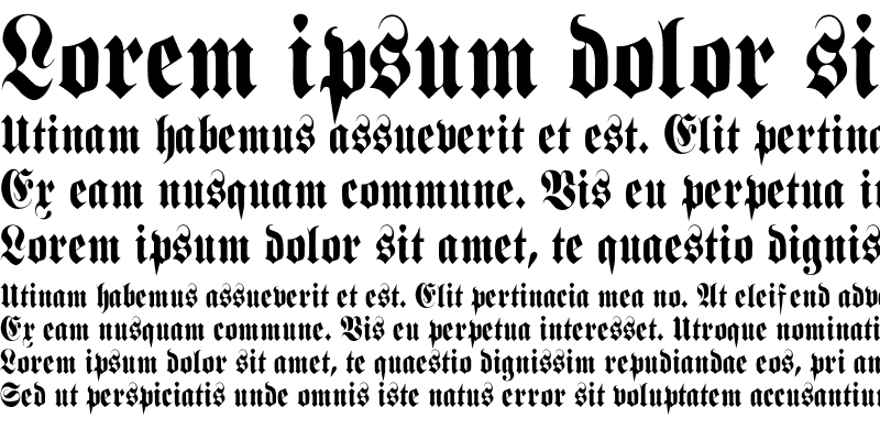
Fraktur looks so aesthetic, every piece of text seems like a word of art
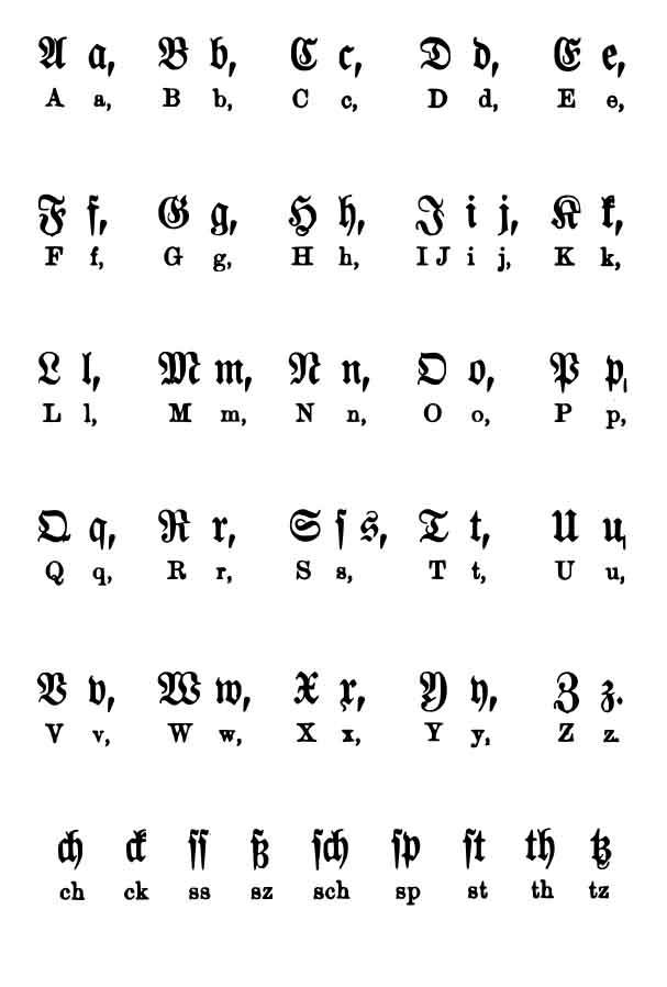
fraktur.jpg

fraktur-medium-sample.png

Beispiel_fu%CC%88r_Fraktur__Antiqua.png


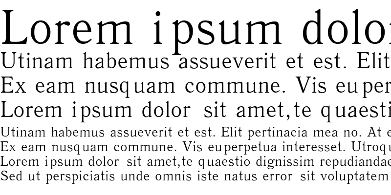
Antiqua looks so casual and primitive compared to it
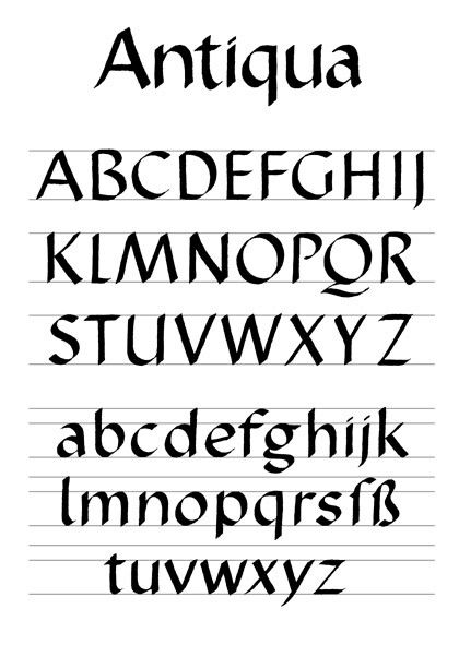
61740ba3431fa592156a4c4294be0d5a.jpg

antiqua-regular-sample.png


Germans should have kept their traditional Fraktur instead of adopting the Med typeface
https://en.wikipedia.org/wiki/Antiqua–Fraktur_dispute
 
  • +1
Reactions: Deleted member 23558, Daniel Plainview, Xangsane and 2 others
The point of a good font is that it's supposed to be legible to everyone.
 
  • +1
Reactions: Deleted member 17872 and JovenCansao
Will research this more when I’m on kratom. I love getting into esoteric shit after drinking some kratom tea
 

Similar threads

Prøphet
Replies
25
Views
123
tansel
tansel
blinkers
Replies
6
Views
43
ShukatsuDev
ShukatsuDev
hax
Replies
22
Views
132
Aox Ofwar
Aox Ofwar
Rabbi
Replies
4
Views
57
Klasik616
Klasik616
dragomog
Replies
5
Views
45
dragomog
dragomog

Users who are viewing this thread

Back
Top